A feature that has been long-awaited in Data Studio is conditional formatting. Finally, the wait is over and we are pretty excited about the potential improvements in data visualisation that it will be able to unlock.
Google Data Studio is a great tool that we use daily, and ever since its inception there have been new features added almost every week (take a look at the release notes). Sometimes it might be the addition of a new data connector or other times it might be a new calculation type that is made available.
Whilst we love Data Studio as a tool, after all, it is free to use and easily integrated with many data sources (especially across the GMP stack), there have always been a few ‘missing’ features that result in either a hacky workaround or ditching the tool for something that natively does the job. When the feature that is missing seems fairly trivial, this can be frustrating.
Near the top of that list of missing features has been the ability to add conditional formatting to dashboard elements - until now.
What even is conditional formatting?
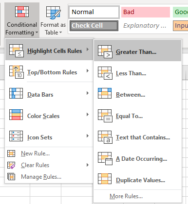
Conditional formatting allows you to highlight cells or rows of data based on the value of the cell. The main benefit of this is to be able to easily identify data that is interesting in some way compared to the rest of the dataset. This could be to pick out individual transactions that are of very high value; keywords that have a high search volume or performance against a target.
It is a very commonly used feature in both Excel and Google Sheets, and there are hundreds of potential uses for it when looking at marketing data.
Visualise performance against targets
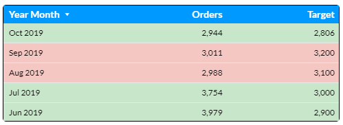
A table with ‘actual’ and ‘target’ numbers can be enhanced with a couple of conditional formatting rules added. Here we show you how to style the background colour of a row, depending on whether the number of Orders is higher than the monthly target:
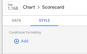
Firstly we select the table element then under the ‘Style’ tab we choose the option to ‘Add’ in the conditional formatting section:
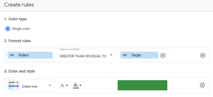
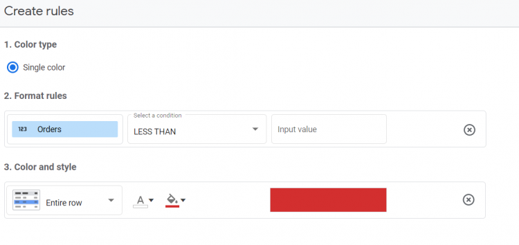
This brings up a panel to create conditional formatting rules. We choose the ‘Orders’ column, GREATER THAN OR EQUAL TO as the condition and then the ‘Target’ column as the value to compare against.
We then select the colour and style that we want to apply based on the condition evaluating to true, in this case, a green background on the entire row:
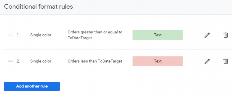
You then need to choose the ‘save and add another rule’ option to add the red background when the number of Orders is LESS THAN the monthly Target:
Once you save this and close the panel, you should see the table updated with the conditional formatting.
Formatting KPI scorecards
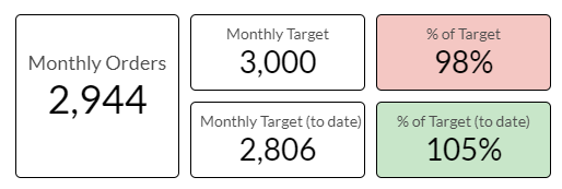
Another good use of conditional formatting is for scorecard elements. Here we use the same ‘Orders’ and ‘Targets’ fields used in the previous example, but we are displaying a scorecard showing the progression toward the target as a percentage:
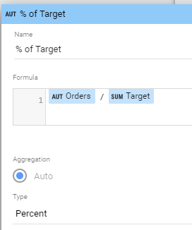
Note: You will need to create calculated metrics to show the percentage as follows (ensuring that the type is set to ‘Percent’):
Once this has been created, we can add conditional formatting to colour the background of the entire scorecard based on whether we are ahead or behind target:
Highlighting branded keywords using the ‘Contains’ condition
There are many other uses of conditional formatting, many of which we have already started to implement within our client's dashboards. This includes evaluating dimension values (text) against ‘CONTAINS’ conditions, such as if a string can be found within a keyword:
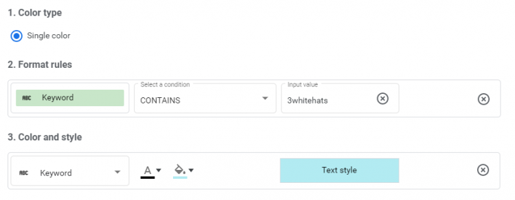
By adding this rule, we can create a table which highlights branded keywords.
Considerations
Rules are added in descending order, so it is possible to ‘overwrite’ one rule with another further down if the condition is met more than once.
At the moment, conditional formatting is confined to scorecards and tables, not pivot tables or other charts. The feature is also very limited in terms of styling, colour scales would be great for example. These extra options will likely come in time as most other new Data Studio features gain additional functionality after release.
This post was created in 2019 and some of the content may no longer be relevant.
If you’re interested in learning more about digital marketing, analytics and data, take a look at our Digital Marketing Services.
Stay up to date
Receive all the latest news, events, and insights on B2B tech, marketing, and communications with Clarity’s free monthly newsletter.
Share this
MORE
INSIGHT
Fearless tactics to achieve your strategic success
As a consultancy, our full-funnel marketing and communications solutions are designed to fearlessly deliver business results across multiple industries and service areas.


